Cartography and Data Visualization Examples
Over the years, I've produced a variety of maps, data animations, time-series plots, and other types of data visualizations. Here, I've collected a handful of examples that demonstrate some of the variety of projects that I've worked on, in addition to the data visualization and cartography highlighted in other projects on this website. Current examples of my work are highlighted through my Twitter and LinkedIn profiles, as well.
- Project lead Eric Jensen
- Collaborators Communications staff, researchers, project managers, etc.
- WebsiteTwitter account
- Tools R, Google Earth Engine, ArcGIS Pro, ArcGIS 10.x, Shotcut, OBS Studio
- Completed Ongoing
CARTOGRAPHY AND DATA VISUALIZATION EXAMPLES
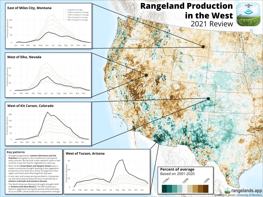
Rangeland Production in the West, 2021 Review
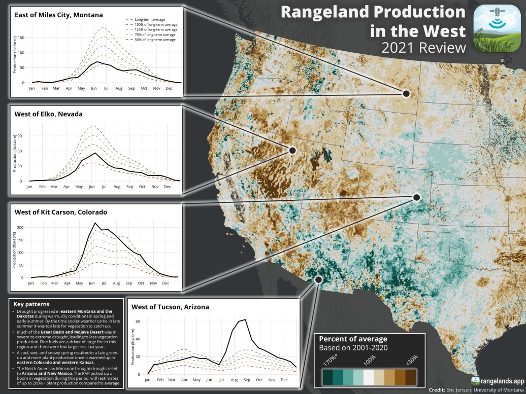
Check out our 2021 review of Rangeland Production in the West -- in original and dark mode! Vegetation patterns driven by:
- Vigorous monsoon in NM and AZ🌧️
- Cool, snowy spring in the far western plains☃️
- Drought conditions in northern plains and Great Basin🌞


Rangeland Production and Vegetation Cover Ecoregion Infographics
With the 2021 Rangeland Analysis data released and added to the previous 35 years, I thought it would be interesting to summarize the broad-scale trends for each dataset in US EPA Level II Ecoregions. Essentially, this is my attempt to unpack
the spatial and temporal variability of rangeland vegetation communities at broad extents.And, even at the broad extents of these ecoregions, clear vegetation patterns and trends are visible in almost all cases. For example, notice the increase in vegetation production in the Cold Deserts that occurs in concert with increases in annual herbaceous vegetation cover — attributable to the spread of invasive annual grasses in the area.


Drought and productivity time-series visualization
Following Google Earth's release of their time-series animation feature, I created a series of three time-series animations focusing on use cases of the Rangeland Analysis Platform data, which is also derived from Landsat. This animation highlighted spatiotemporal patterns between drought (SPEI, GridMet data) and vegetation production (% anomaly, RAP Rangeland Production) at the broad extent of the western U.S., which track closely together in both cases. This tweet received 69 likes, 5,800 impressions, and 10 retweets.
For this final ecological #TimeSeries animation this week, I related @NASA_Landsat derived biomass anomalies to GridMET 2-year #drought data
— Eric Jensen (@RangeSpatialist) April 23, 2021
Knowing relatively little about drought, it was fun to see the relationship borne out in the data#RemoteSensing #EarthEngine #Rangelands pic.twitter.com/kX3DsWD3oe
Fire and annual forb and grass cover (cheatgrass) time-series visualization
Following Google Earth's release of their time-series animation feature, I created a series of three time-series animations focusing on use cases of the Rangeland Analysis Platform data, which is also derived from Landsat. This animation highlighted spatiotemporal patterns between fire frequency (Times Burned, Monitoring Trends in Burn Severity dataset) and cheagrass cover (Annual Forb and Grass cover, RAP Vegetation Cover), depicting the role that fire can play in facilitating cheatgrass cover increase in portions of the northern Great Basin. This tweet received 15 likes, 4,000 impressions, and retweets from the NASA Landsat Program and Great Basin Fire Science Exchange.
Another example of ecological #TimeSeries data at work, inspired by @googleearth and derived from @NASA_Landsat!
— Eric Jensen (@RangeSpatialist) April 21, 2021
This time we're in the northern #GreatBasin, where there is a strong relationship between fire (left) and cheatgrass (right)@GBFireScience #EarthEngine #rangelands pic.twitter.com/kxys1fLP48
Tree encroachment and diminished rangeland productivity time-series visualization
Following Google Earth's release of their time-series animation feature, I created a series of three time-series animations focusing on use cases of the Rangeland Analysis Platform data, which is also derived from Landsat. The animation below highlighted the role that tree cover (Tree cover, RAP Vegetation Cover) can play in diminishing rangeland productivity (Total Production, RAP Rangeland Production).
With @googleearth's release of timelapse, it's a great time to highlight ecological time-series data!
— Eric Jensen (@RangeSpatialist) April 19, 2021
Here, @NASA_Landsat is next to Rangeland Analysis Platform (also using Landsat) tree cover and annual herbaceous biomass data in Loess Canyons, NE @LPCInitiative #EarthEngine pic.twitter.com/xUyvkbHBlx
Historical imagery swiper and time-series plots — featured in Intermountain West Joint Venture's conifer management story
map
The historical imagery and time-series animations highlighted in the tweet below were produced for the Intermountain West Joint Venture's Horizon-to-Horizon: Improving Habitat at a Landscape Scale story map.
Fun project to provide #dataviz for! Three figures:
— Eric Jensen (@RangeSpatialist) December 4, 2021
1) Historical imagery product to visualize conifer cover in 1953 compared with today.
2+3) #Landsat #RemoteSensing data depicting (beneficial) plant response after removing encroaching junipers.
Awesome data to work with!🤯 https://t.co/eMLkXEr09F pic.twitter.com/oVouUMyD6F
Map for Soon-to-be-published Conifer Encroachment Education Program website
The map below depicts increases in tree cover that have occurred between 1990-2019 in the sagebrush biome. The map will be used on an educational website for the Conifer Encroachment Education Program through a partnership led by the
Univerisity of Nevada-Reno. 
Map Animation for Soon-to-be-published Conifer Encroachment Education Program website
The animation below depicts tree cover at a decadal time-step for the years 1990, 2000, 2010, 2020 showing the steady increase in tree cover across the sagebrush biome. The animation will be used on an educational website for the Conifer
Encroachment Education Program through a partnership led by the Univerisity of Nevada-Reno. 
Restoration of Trout Creek at Priday Ranch video
This short video highlights the outcomes of a riparian restoration project in central Oregon using RAP Rangeland Production data. The animation was produced using Google Earth Studio. For another example of how I use Google Earth Studio
to visualize spatial data, see my video on Using RAP to Understand Spatial Variability
Northwest Basin and Range Synthesis Project Map
I produced this map to support the Great Basin Landscape Conservation Cooperative's Northwest Basin and Range Synthesis landscape conservation design project. Because of the diverse federal, tribal, non-profit, private, and academic
partners involved in the project it was important to depict landownership to support project planning. Ultimately, this map was used at a workshop to support a participatory mapping project and as the primary study area map for
presentations and other media. 
Coast Salish Tribal Territories Map
I created this map as a final class project for my Computer Cartography undergraduate class in 2011, along with a map depicting ecoregions of the Salish Sea. These
maps are still highlighted on the course website.
Animation of Fires in the Great Basin (1984-2017)
This animation depicts fire activity on an annual basis using the Monitoring Trends in Burn Severity dataset for the fire perimeters and a custom 20-year average maximum NDVI map as the basemap which I produced in Google Earth Engine. The
majority of acreage burned in the region over that 34-year period occurred in only a few years, with an increasing frequency of very large fires (150,000+ acres) toward the end of the time-series

Colorado Front Range Fire Severity Map
I created this map for the 2020 Summer term of NASA DEVELOP for the Colorado Disasters project evaluating post-fire recovery — more information here. The map depicts the locations of
four selected wildfires—Bobcat, Buffalo Creek, Hayman, and High Meadows—along the Colorado Front Range, USA. Tree canopy cover data was retrieved from the National Land Cover Database (2016). Fire severity data was taken from Monitoring
Trends in Burn Severity. 
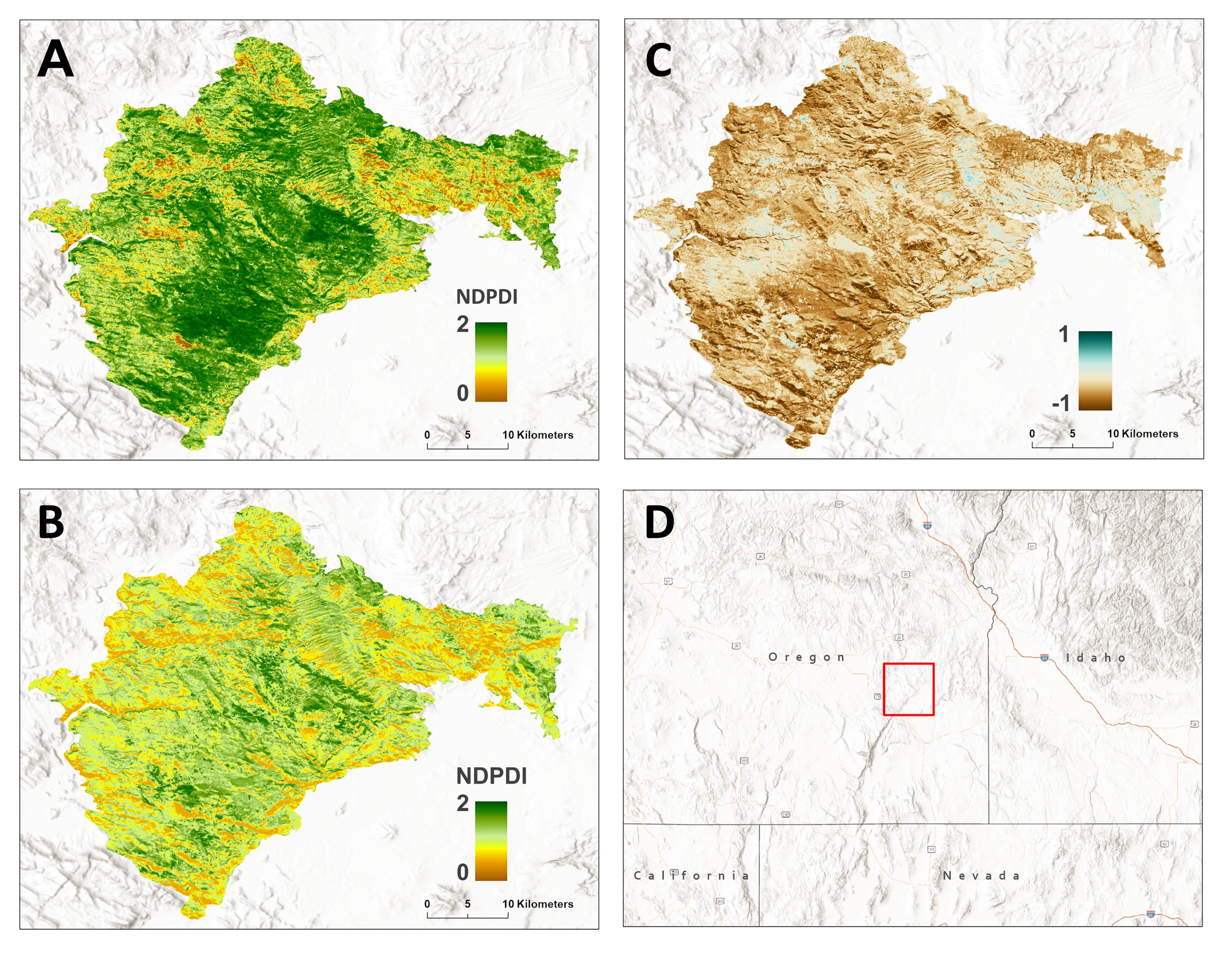
Saddle Draw Fire (2014) Modeled Post-fire Vegetation Recovery
This map layout came from my thesis and depicts vegetation in terms of NDPDI for the Saddle Draw Fire in southeastern Oregon in 2014. Pre-fire NDPDI (median of NDPDI between 2011–2013), B)
modeled predictions of 15-year post-fire NDPDI corresponding to the year 2029, and C) differenced image of B – A.